


Simulation centers routinely collect vast amounts of data through scheduling platforms but much of it goes often underutilized. Hidden within this raw data are powerful insights about learner volume, room utilization, staffing needs, and equipment wear. This article explores how a structured approach to data and visualization with proper tools, even free, can transform passive data into actionable intelligence. By making trends intuitively visible, simulation programs can improve efficiency, inform staffing, support budgeting decisions, and plan future growth. Learn how to bridge the gap between data collection and meaningful decision-making through clear, compelling dashboards.
Every day, simulation centers around the world collect thousands of data points, such as who came, what room they used, how long they stayed, and what they practiced. Yet, despite the abundance of this information, much of it remains dormant, stored in scheduling software and forgotten spreadsheets. The real problem isn’t a lack of data; it’s a lack of insight. But what if all that information could be transformed into visuals that instantly reveal trends in usage, staffing, and resource needs?
That’s exactly what this article explores: how simulation centers can extract meaningful metrics from their existing data, without expensive new systems or advanced analytics training.
From Raw Numbers to Real Insights: The Data Challenge
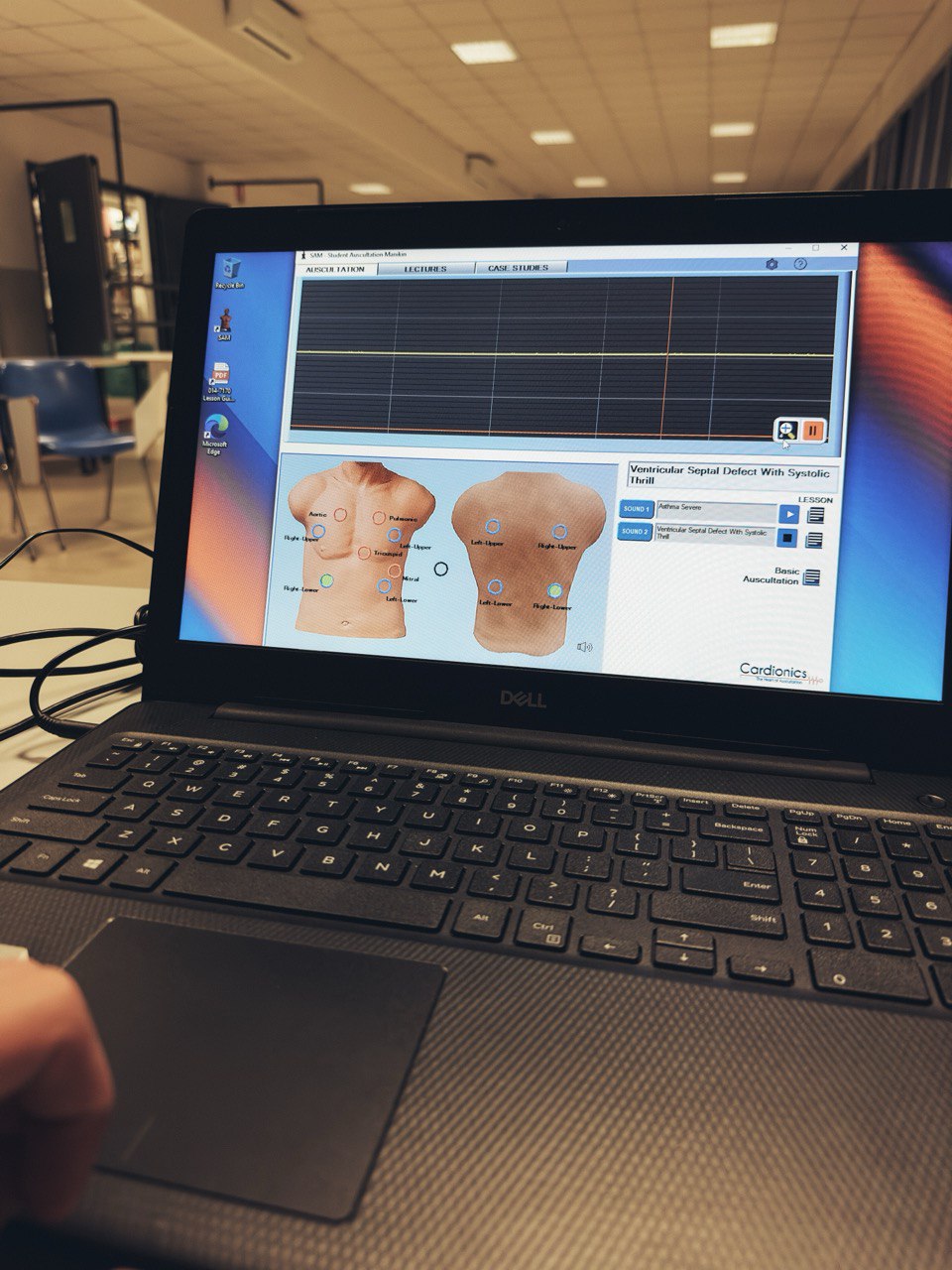
Data collected from scheduling and other software utilized by simulation programs can be imported into data visualization software to provide a foundation for decision making. Data such as number of learners, learner types, room utilization, and equipment use are all data points that can inform effective business decisions related to growth, staffing, and purchasing for simulation programs. Though there are many solutions to both software for simulation scheduling, audio visual, and data visualization, this article will be centered around how we imported data from Laerdal Medical’s SimCapture Pro to Microsoft Power BI to create informative data visuals.
Tools You Probably Already Own: SimCapture and Power BI
SimCapture has two versions, pro and enterprise. Both SimCapture pro and enterprise have the same utilization reports, with a key difference being that enterprise has more reporting based on specific learners and grading. Another feature of SimCapture enterprise is calendar reporting, which includes the number of activities and utilization [1]. In the absence of enterprise, pro users can utilize the raw data export feature of SimCapture, descriptive session naming conventions, and data visualization software to depict utilization trends.
Similar to SimCapture, licensing for Microsoft Power BI has different options. A free account with Microsoft will allow for the full use of Microsoft Power BI Desktop. Subscriptions for pro and premium licenses have more features related to how reports are shared and other advanced features. Pro has the ability to publish reports to the web, which is a convenient method for sharing interactive dashboards built within Power BI Desktop [2]. Using the free account with Microsoft Power BI Desktop, interactive reports can still be viewed locally and exported to .PDF, .JPG, and other file formats.
Start with the End in Mind: Define the Metrics that Matter
One of the first steps in data reporting is to take inventory of the data currently being collected and determine what data is needed or anticipated in the future. When determining needs, it is important to consider the source and workflow of the existing and future data. Having defined and policy driven standards for data entry and workflows will help ensure the accuracy and validity of data within the dataset. Inconsistent or inaccurate data will have to be properly organized and corrected before it can be quantified, this process is known as data scrubbing.
Within any system for data collection, the integrity of the data will only be as good as the data collected. If your system or workflow for capturing data is not collecting accurate data, the data will have to be scrubbed or otherwise manipulated to reflect accurate reports. Scrubbed data can become skewed when memory of the event and other records fail to reflect accuracy. To promote consistent data over time, the process of scrubbing should follow a standardized and documented process. Otherwise, data from 2024 may not be held to the same standard in 2025 and subsequent years and this may present inaccurate trends.
The Secret Sauce: Naming Conventions That Work
For our use of SimCapture Pro and data visualization, it is important that each session title follows a uniform naming convention. The naming convention should be centered around the data you wish to obtain. SimCapture Pro will obtain the number of learners, date, time, and duration of the activity. The session title will have the be the source of all other information you would like to track. For example, if you would like to track the School or Program, the semester, as well as the room(s) utilized you would need a consistent naming convention for session titles with these data points.
Within SimCapture, the field for session title can contain up to 300 characters. As not all views of the software can easily display 300 characters, more is not always better. The naming convention should also consist of listing items in the same order to make sorting data within Microsoft Excel easier. For example, if you would like to depict campus, course number, learner type, learner level, and room used, you would need the following naming convention for the session title: [Campus]_[Course Name Number]_[Room].
Naming conventions should follow your userbase. For example, an academic institution using the official course catalog name and number allows for further data synthesis without adding to the length of session title. Though short, institutional course numbers can inform the learner type (RN, LVN, etc.) as well as the level (First Semester, Level 2, etc.). In the absence of course numbers or other identifiers, longer sessions titles within SimCapture would be required.
Transforming Reports into Stories: Excel as a Bridge
The learner contact hours report captures the following fields: session title, number of participants, learner contact hours, as well as start and end date and time.

Exporting the report to Microsoft Excel and creating a table with the data allows the ability to derive more information that can later be quantified and added to a visual. For example, once the start date column is sorted ascending within the table, a new column can be added and labeled Semester. Using the start date as reference, the fill handle within Excel can then be used to quickly populate each row with the appropriate semester. Other information such as year, month, can be included along with information derived from the naming convention of the session title. Additionally, formulas within Excel such as =TEXT(B2, “dddd”) can return the day of the week for the start date. Formulas can also be used to calculate a duration of activity in minutes in lieu of hours.

It is important to note that without placing the data in a table and leveraging sorting columns, the fill handle, and formulas, manual data entry would be a very tedious and cumbersome task. Additionally, using the flash fill feature of Excel to sense patterns and automatically fill data can be a powerful time saving tool [3].
Capturing True Presence: What Sign-In Data Can Reveal
The center sign in hours report within SimCapture depicts the name of each learner, date of activity, and the time each learner signed in and signed out. Utilizing a sign in kiosk and workflow that requires learners to sign in upon arrival and out upon departure provides an accurate account for how long each learner was in the simulation center.
The column for date and time could be split into separate columns and formulas within excel could be used to total the number of hours each learner spent in the simulation each day/week/month/semester. The authors remain curious as to evolving trends that could correlate time spent in simulation and skills practice and learner success. To protect the privacy of learners, we did not provide any examples or data visuals for sign in hours.
Building the Big Picture: Power BI in Action
Importing the learner contact hours spreadsheet with the derived and scrubbed data into Microsoft Power BI will allow for the creation of individual data visuals and dashboards. From the following visual, we can conclude that February is the busiest month of the year. Also, Fridays in February have the most learners, but Thursdays in February only had 13 learners. Our dataset starts in 2024, but as the data scales over time 2024 could compared to subsequent years to measure growth.


Staffing Smarter: Matching People to Demand
The number of activities and the number of learners can be used to determine staffing needs and adequacy. However, as much of the work can happen before or after an activity, the number of learners on a specific day may not be an accurate representation of staff workload. Heavy learner utilization in the morning can be indicative of afternoons or evenings being utilized for setup and tear down of activities.
Staffing adequacy can be assessed by conducting a time study or making assumptions related to the average setup or teardown time by program and or course. The total number of activities multiplied by the timed events such as activity design, setup, teardown could inform staff workload. Other considerations of work duties, such as allotments for meetings, vacation, projects, and professional development can further inform the equation. Columns for setup and other time tracking events could be added to spreadsheet and calculated on the dashboard in Power BI to depict workload.

Data for Longevity: Equipment Use and Maintenance Trends
Trends with the utilization of specific rooms or equipment can be helpful to inform maintenance needs or wear and tear. In terms of life cycle replacement for equipment, it may be beneficial to evenly distribute wear. When utilization is compared with repair records, trends could indicate that specific skill sets, such as intubation could also be limited to a specific simulator or are attributed to a specific program and billed accordingly.


Conclusion
Data is only as valuable as the story it tells. When simulation programs commit to structured data collection, meaningful naming conventions, and smart visualization tools, they gain more than just dashboards: they gain clarity. The insights extracted from platforms that collect learner and utilization data, like SimCapture, can help simulation centers managers to better develop staffing strategies, identify training gaps, optimize resource use, and even extend the lifespan of simulation equipment. It’s time to stop letting valuable data collect dust. By turning spreadsheets into strategy, simulation centers can evolve into data-driven engines of continuous improvement.
REFERENCES
- [1] SimCapture Cloud Enterprise: Reports and titles of reports [Internet]. https://help.simcapture.com/en_US/enterprise-cloud-getting-started/simcapture-enterprise-reports-and-titles-of-reports.
- [2] Power BI pricing [Internet]. https://www.microsoft.com/en-us/power-platform/products/power-bi/pricing#tabs-pill-bar-oca31b12_tab0.
- [3] Using Flash Fill in Excel [Internet]. https://support.microsoft.com/en-us/office/using-flash-fill-in-excel-3f9bcf1e-db93-4890-94a0-1578341f73f7.
READ ALSO